10 Best Examples Of Minimal Logo Designs For Inspiration
Minimalist designs are the most popular and prominent graphic designs in past years.
When we narrow down the term minimalism, we see that it is less a visual style and more a principle. These designs use only the essential elements like the basic shape and limited colour palette, creating something simple yet memorable.
You are looking for ways to show off your brand’s personality with a custom minimal logo, designed by a professional designer? Need some ideas?
This blog has gathered amazing notions for these logos from around the globe. So let’s get started.
10 Minimal Logo Designs Of Famous Brands
Apple
The Bite Apple of the company Apple is considered one of the most famous minimal logo designs, as its simplicity makes it easily identifiable and adaptable to different media and sizes. Moreover, the unique and instantly recognizable apple shape with a bite taken out prevents it from confusing with other fruits. A non-apple user will even recognize the brand. The choice of colour palettes and icons has helped people quickly identify the brand.
Have you ever thought about the reason behind the use of a basic apple shape with a bite out of it? The company quotes the official reason behind this bite, which represents the ability of the computer to take a bite out of a problem. But other theories revolve around it. Some say that the apple’s bite represents the wisdom and creativity of the company’s values to push boundaries and embrace change.
The choice of colour palette ranged from the rainbow stripes in the past to the elegant monochrome version. The logo’s minimalist but striking design makes sure that it is effective on different brands with the creative element.
Nike
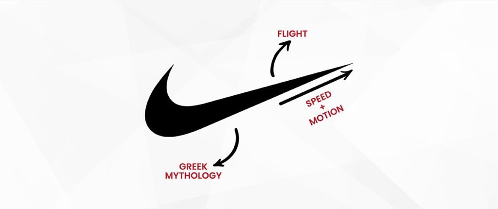
The most famous logo of today’s time, the Nike swoosh, is one of the best examples of minimalism. Have you ever found the reason behind the worldwide recognition of the simple Nike logo design?
It is hard to believe that the design was not planned with the expertise of high-priced designers. But an enthusiastic graphic student is the mastermind behind this swoosh. It is displayed on different items, giving a feeling of being active and successful. What made this simple swoosh so famous? However, there is a long story hidden behind it.
The symbol symbolizes the sensation of the wind speeding near you while surpassing a personal best feeling when testing your boundaries. Apart from what the swoosh looks like, it symbolizes something very deep. It represents a success that is obtained through effort and commitment. This is one of the reasons that it is presented in athletes’ shoes, connecting them and individuals to work for their objectives.
Starbucks
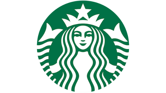
Have you ever noticed that the Siren on the Starbucks logo is more than just her long and wavy hair? This monogram has some hidden secrets that you might not know.
This secret can be unfolded from the Siren’s face. It is something small, but it is worth noticing and realizing how clever the designer has crafted the masterpiece.
When observing closely, you will notice the tiny detail on the upper-right side of the character’s facial features. It is on the right nose. The nose is asymmetrical. Upon closely observing, you will find an extended shadow on the right side of the nose. But the question is, why did a coffee brand choose to show this way? This is because it looks more human, approachable, and natural.
Then, what does this monogram try to explain to its clients? The message is that imperfection is not a cure; it is natural beauty. The brand wants its consumers to accept the fact that imperfection is what makes us all human and natural.
If you wish to design your brand monochrome with some unique style and a hidden message, services like company profile maker or others can help you.
Amazon

Amazon, one of the largest online retailers and marketplaces in the world, has a logo that looks simple at first sight. But it has some messages for its target customers.
One of the vital features of this monogram is its arrow. It is yellow in shade, and people can easily notice them from a long distance. But there is some hidden meaning behind it.
It is clear what the smile in the logo means. It shows that the person is happy and satisfied in life. A person who is smiling spreads happiness all around the world. We can say that smile is contagious. This is one of the reasons that the company chose the arrow as an element of joy in the logo. This arrow looks like a smile on the face. This links to the happiness and satisfaction that customers feel after purchasing from the brand.
Moreover, the arrow connects to the letter ‘Z’ of the brand name. This conveys the symbol of the availability of the product for its consumers.
Netflix
This logo is an example of a well-developed design. It has some hidden meanings. The main idea of the monogram is that a viewer gets a feel of the cinema without leaving their comfort zone. The logo has transferred its meaning using features that affect associations and avoid obvious symbolism.
Examining the logo, we can say that the red and white colors in the logo have some meanings. The red color reminds us of the armchair material in cinema. A noble letter fading carries us into a dark hall and readies us to watch some movie. Some people symbolize its meaning on their own. They think red symbolizes energy, power, and passion, while white color is chosen as a background.
Airbnb
The monogram of this brand shows that the minimalist doesn’t refer to being uncreative. All the creativity is hidden in the shape of the letter ‘A’, designed to represent the inclusivity and community that is the personality of the brand.
The logo consists of two parts. One is the customized version of the Lineto Brown typeface and the symbol is a single, flat looping line.
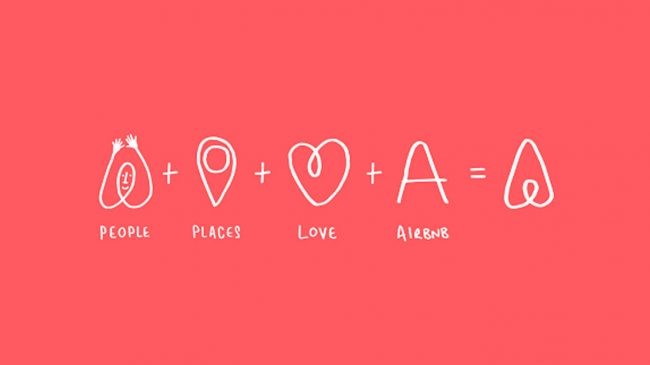
When we recall the history of this brand, it is nicknamed the symbol ‘Belo’, which represents the universal symbol of belonging. Its design showcases four key principles: people, place, love, and Airbnb. The creativity is so exceptional that once a person comes to know the creative element behind it, they can never unsee it. This makes the symbol to be appreciated on different levels especially when it comes to minimal logo designs.
BMW
Minimalism has made the BMW logo more versatile. This not only makes the brands more aesthetically pleasing, but they can easily market themselves on all communication platforms.
Then what is the hidden mystery behind the color palette used in the BMW logo? The choice of blue and white colors represents the State of Bavaria in Germany which is the home of BMW. Additionally, it is also believed that the design resembles a plane’s propeller. Although this is a myth, the brand’s history of producing the aircraft fits the context. No doubt there are several changes observed in the design over the years. However, the meaning and aim of the minimal logo designs remain the same.
Mastercard
One of the best examples of a great marketing idea with a minimalist logo design. The design evokes people’s trust in its services. Two colour circles overlapping each other is the unique design that customers prefer and can recognize even without the brand name.
Do you know what does this logo mean? The circular shape indicates easy accessibility of the company’s products to its audience. It also expresses the inclusiveness of the card for everyone. Have you noticed that the two circles combine to form a different-coloured shape in the middle? This indicates the unification and connection with more people from other continents. The shape of the logo is a geometric composition with two circles in red and orange. They overlap to symbolize unity, connection, and cooperation.
Louis Vuitton
The world’s famous luxury lifestyle and fashion brand has a logo with the initials L and V. Its monogram is easily recognized in the world of fashion, becoming synonymous with class, comfort, grandeur, and luxury.
Analyzing the initials, in a Roman serif font, the icon features an italicized ‘L’ below the ‘V’, adjoining with an array of floral motifs. The four-point star has three associations. The first symbolizes fortune, the next symbolizes joy, and the last hidden inside the diamond signifies passion. These motifs run together with the monogram in today’s designs.
Now, in terms of the color palette, this logo uses two versions. One version is the monochrome that is versatile enough to look good on any surface and the next is a neutral one that is close to gold exuding sophistication and reflecting the essence of the fashion brand.
Uber

A fantastic example of applying minimalism to a wordmark logo, a type of logo design. What makes it unique from others is its use of perfect and simple font, which distinguishes it from other apps that use monograms or symbols.
The white colour used in the font combined with the black background embodies the company’s vision to innovate and push the boundaries of the possibilities in the transformation industry and beyond. Visually representing the core values of the brand: connectivity, efficiency, and a relentless pursuit of progress. Additionally, the evolution of this minimal logo design reflects the company’s growth and commitment to accept rapid changes around the world.
FAQs
Which is one of the most popular minimal logos?
One of the minimal logo designs that is still famous among the general public is the swoosh of Nike. Although the brand was created back in the past, it still has a meaning hidden in its logo.
What are some of the tips to design a minimal logo?
The process of designing is easy. Choose simple shapes and monochromic palettes in your designs.
Can these designs help in a growing business?
A minimalist design is the best option if you want your brand to stay out of the crowd. Design a logo wisely.
Which are the most common colours used in these designs?
The colour palette revolves around black and white shades. These make the logo features stand out. But you can experiment with different colours.
The final thought
The famous brands’ logo above was simple yet conveys some message for its audience.
Sourcing a minimalist logo is easy with the help of some designers. Tell the designers about your brand’s aims and objectives and inspiration from minimal logo designs. They will help you in designing one that will have some hidden secrets behind the designed monogram.
I serve as the editorial lead for the Company Profile Maker Blog, where I break down branding best practices, profile writing tips, and business growth strategies. With years of experience in corporate communications and marketing, I aim to empower entrepreneurs and professionals with content that converts.

